Friday, November 24, 2023

Fabulous Ladies

Hi everyone

Sorry I have been missing in action these last couple of months.  We had a fabulous overseas holiday to Spain, Portugal and London, and then some technical difficulties!

Before I show you layouts from our trip, I want to share a couple of recent layouts of some beautiful netty ladies in my life.  

I recently attended a scrapbooking retreat and these layouts were inspired from some online challenges.  I hadn't scrapped for ages and find that these challenges are great to get the mojo flowing.


ST9024 Brick Stencil


ST5084 Stencil Symbols


CB1268 Floral Spray 16


CB4069 Ornate Frames 26


CB6117 Assorted Words 30


CB1236 Scrap Words 22


ST9076 Cobblestones Stencil


CB1249 Stars 04


CB1236 Scrap Words 22


There are many online challenge sites who have new themes each month.  Its a great way to be inspired to create.

Hopefully I will now get back to regular posting!  I have some great layouts for you in the next few months - photos from our trip.

Happy Scrapping

Lisette 😊


Tuesday, November 7, 2023

November Creating

 Good evening my lovelies.

I am very late with my post today but considering that I missed last month completely at least I am here now.

For this month I have two very beautiful girls in very different poses, the first is my beautiful little neighbour, Alaina who looks so cute in her little overalls that belonged to her dad when he was around the same age, his Mum had kept them and bought them over when she came for a visit. Really do suit her so much.


For the page I used a leafy type stencil with some Forest Moss ink, the same color I used on the chippy pieces except for the title which was already black.

I am a big fan of putting cardboard under photos, raising them up to add some dimension and interest to the page, in this case I only did it behind the smaller pic.

PRODUCTS USED

ST9073 Leaves Stencil


CB4063 Leaf Spray 13 - White Mist


CB5189 Flourishes & Leaves 01


CB6103 Scrap Words 21


Next is a stunning pic of a friend's daughter, as soon as I saw it, I knew I had to scrap her, may have done it and then asked if I could use her pic, thankfully once she saw the layout Mum was very happy.

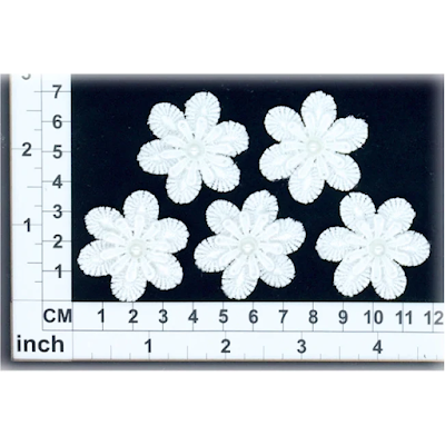
On this page I used some music notes which I left raw, a piece of the Doorway set inked orange to match the background behind her and some of the gorgeous little lace flowers.


PRODUCTS USED


Well that is me for the month.

Hopefully I will be back on track for December, oh my goodness, it will be here before we know it.
I look forward to going to the Retreat at Neville in a couple of weeks, with Kim Ewins, we always have such a lovely relaxing time there, and the ladies are just so nice and welcoming.

Until next time
Hugs and love
Annette 
xx

Thursday, October 5, 2023

So why did you choose thatπŸ‘‡?

 Today I'm back to share a layout made using a bunch of odds and ends 

that I had left over in my hoarder-like chipboard collection 😜 

I thought it migth be a good opportunity to unpack the reasoning behind colour and embellishment choices.


I've been a scrappr for about 25 years now so when I say I have 'leftovers' ...
I mean I have enough to open a small shop! lol 😬 

So I don't reach for the 'perfect' paper to go with a photo anymore... I reach for the ones I can make work from my extrodinaryly large stash of papers, but here's what I found to be true on this journey - with the right colours and some coordinating embellishments it turns out its quite easy to use up all those last few bits of chippies in the bottom of packets, the leftover stickers and the random bits of paper floating around from a long gone collection! 

For example ...

here I've pulled in a hanging light, a bunch of word tiles and a title I had been hanging onto for ages.


By inking them all brown it pulled the whole layout together nicely and complimented some of the more pronounced colours on the papers as well as complimenting the tones in the pictures. 


But something had to be done to address that giant teal shirt my son has on in the picture - it really dominates the whole scene, so I used a similar coloured paper for the border and linked the photo and borders together by adding this simple chainlink-fence backgound stencil and some teal ink.


I used the large stencil from this set for this page, but I usually use the middle size one for busier layouts with more on them (and the small one for cards). I ALWAYS buy my stencils in sets like this now for this very reason - I love the versatility of size variations. 


Simple, yet so effective for tying 
colours and elements of layouts together!


Next I'm sharing this very busy step card - 
that was quite a challenge for me to make!

 I made it for my wild and beautiful daughter and I was determined to make the card FOR her - which meant it couldnt really be my usual style.  My daughter is increadibly perceptive and if I made her a card in my usual style she would just brush it off as 'mum gave me one of her fussy cards' lol πŸ˜† 
So I had to create somethng here that reflected her personality ... 
Wild, messy and free!


The paper itself was more than enough all on its own but I was determined to add in some little touches that showed I had gone to effort. 
One of the Scrapmatts small 'Happy Birthday' titles was perfect for the main content.


And then to contribute to the overall 'messy garden' feel I added in this twig I had left over from this lovely branch and birds set. 


The other embellishments were pretty much just added to give it that 'I just wandered into this field of wild flowers' look. I struggled with how busy this ended up - even the number 'eighteen' at the top I woud have prefered to have mounted nicely on a backing strip and displayed prominitely somewhere, but once again, in an effort to make it less about me and more about the person recieving it, I atempted to relax a bit into a more casual style
πŸ’š


And thats it from me today folks... thanks for bearing with me to the end of my creative ramblings. 

I hope you enjoy your own creative adventures until next time. 


Cheers, Kel xo


Thursday, September 7, 2023

Lest we forget

 Welcome to my post this month.

First up I have this fantastic old pic of my Dad in the Army, unfortunately I don't know when or where this was taken but I think he was in his early 20's.

Except for the poppies I kept the rest of the chipboard raw.


PRODUCTS USED

CB5211 Poppies 01


CB5188 Theme Pack 01


Then I have this page that has an amazing old pic of my Grandfather in his Airforce uniform. Like the pic of my Dad I don't have a lot of information about this pic but I have been trying to find out some more so fingers crossed I will be able to.

I used some red ink on just the top of the poppies and the two words.


PRODUCTS USED


Well, that is all for me this month. I know it's a very short post, but there have been a few challenges for me recently.
I have my pages ready for next month and they are just so precious so I hope you will come back and see them.

Until next time
Hugs and love to all.
Annette xx

Monday, August 28, 2023

Achieving that 'painterly' look πŸ–Œ


Over the years I've been through a few different phases with my scrapbooking style but one that I just seem to come back to over and over is that lovely painterly look - I just a dore the messy edges and uneven flow of watercolour pigments so I thught I would lean right into that this month and use stencils and watercolour pens to liven up my pages this month.


For this first layout I used the beautiful tile stencil from Scrapmatts to fill in the border around my page.


I still used ink with the stencil (I find it easier to cntrol than actual watercolour paint) but I made sure to load on some edges and leave them unfinished or messy on others... the effect is subtle but really works to give the finished product a nice 'pinterly' feel. 


For my chipboard pieces on this page I simply used  water colour pens that allowed me to layer over sections to make some parts darker than others - giving the pieces that 'flowing' look.


And of course I chose papers that already had some watercolor flowers all over them - 
I just adore this set from Stampin' Up!


I also scattered some of these little gems about the layout to finish off with some sentiment. 


For the next layout I used a set of setncils to create a soft layered background look.


This wonderfully versatile set of stencils gives you 3 different size tress to use in building up a background effect - perfect for this kind of project (and very handy to have around at Christmas time lol). 


I used different colour water based inks to layer in the trees - deliberately overlapping them so they woud have that 'see-through' watercolour look. Another thing I did afterwards was some small water splatters to give them a bit of an extra painterly look (although I think most of this effect eneded up under my photo lol - you can still see a couple of the water marks on the second photo below). 


Giving the page a torn border is another way to add a watercolour look to a layout as that uneven two-tone edge is very reminicent of watercolour edges. 

Now I know what you are thinking - why go so much effort to have watercolour elements and not just use watercolour? The truth is that real watercolour is MESSY and you need some serious skills to control the flow of colour and form when using a brush - but these tricks make the look too easy! πŸ˜‰


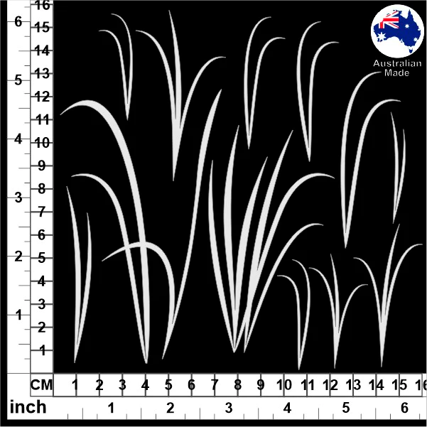
I used a classic watercolour look background paper here so the foreground was easy to add some shiloete shapes to and for this layout that meant thse beauful reed and grass chipboards.. 


These guys I couldn't resist adding just because of my 'Love Birds' theme for this page...


And to finish off I used this mix of chipboard words to add a title. 


And thats it from me today - I hope you have a lot of fun experimenting with your own watercolour and painterly styles - if you have any other tips for aching a nice painterly look, please drop them in the comments section below - I'm always keen to add to my bag of tricks! 

Cheers, Kel xo