Over the years I've been through a few different phases with my scrapbooking style but one that I just seem to come back to over and over is that lovely painterly look - I just a dore the messy edges and uneven flow of watercolour pigments so I thught I would lean right into that this month and use stencils and watercolour pens to liven up my pages this month.

For this first layout I used the beautiful tile stencil from Scrapmatts to fill in the border around my page.

I still used ink with the stencil (I find it easier to cntrol than actual watercolour paint) but I made sure to load on some edges and leave them unfinished or messy on others... the effect is subtle but really works to give the finished product a nice 'pinterly' feel.

For my chipboard pieces on this page I simply used water colour pens that allowed me to layer over sections to make some parts darker than others - giving the pieces that 'flowing' look.


And of course I chose papers that already had some watercolor flowers all over them -
I just adore this set from Stampin' Up!

I also scattered some of these little gems about the layout to finish off with some sentiment.

For the next layout I used a set of setncils to create a soft layered background look.

This wonderfully versatile set of stencils gives you 3 different size tress to use in building up a background effect - perfect for this kind of project (and very handy to have around at Christmas time lol).

I used different colour water based inks to layer in the trees - deliberately overlapping them so they woud have that 'see-through' watercolour look. Another thing I did afterwards was some small water splatters to give them a bit of an extra painterly look (although I think most of this effect eneded up under my photo lol - you can still see a couple of the water marks on the second photo below).


Giving the page a torn border is another way to add a watercolour look to a layout as that uneven two-tone edge is very reminicent of watercolour edges.
Now I know what you are thinking - why go so much effort to have watercolour elements and not just use watercolour? The truth is that real watercolour is MESSY and you need some serious skills to control the flow of colour and form when using a brush - but these tricks make the look too easy! 😉

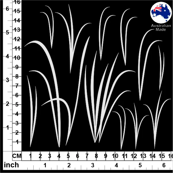
I used a classic watercolour look background paper here so the foreground was easy to add some shiloete shapes to and for this layout that meant thse beauful reed and grass chipboards..

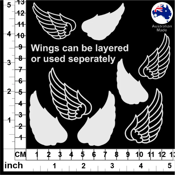
These guys I couldn't resist adding just because of my 'Love Birds' theme for this page...


And to finish off I used this mix of chipboard words to add a title.


And thats it from me today - I hope you have a lot of fun experimenting with your own watercolour and painterly styles - if you have any other tips for aching a nice painterly look, please drop them in the comments section below - I'm always keen to add to my bag of tricks!

Cheers, Kel xo