It was difficult, but I finally tore my attention away from beach layouts to pull
together some alternate designs lol 😂
This month I chose to go all in with beautiful patterned papers, making the most of stencils
and even using the chipboards housing as a stencils!
The papers in this layout are from the 'Bohemian Bliss' collection by Bee Arty, designed by Sue Smyth.
I had been sitting on these photos for ages as the they had some difficult colours in them to work with ... pink on a boy and a whole family with pink and blue mixed in. The whimsical papers were perfect for both and the chipboard embellishments easily worked in with the patterns...
You've gotta love it when a plan comes together!
The title for this page was coloured in with black sharpie and some white shine lines added ...
the easiest technique to pull off and my all time fav.
For embellishments I began by adding these beautiful leaf sprays.
And with the left over chipboard housing I created a stencil so I could add more of the leaf sprays around the layout.
To do this I just coloured in the chipbord spaces with a while gel pen.
Of course ... no layout is complete without a few expressive words...
This second layout is my Easter offering ...
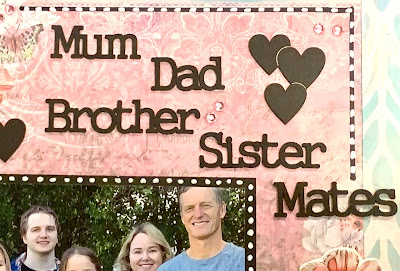
and a bit more structured to reflect the formal photo I've used this time
I have sooooooooo many family photos that I find it difficult to come up with new ideas for pages so I'm always happy to reach for my chipboard stash to help me out with add ons!
This time I went for simple titles that tell the story of our relationships 💚
And this lovely title that I didn't have to do a single thing with
- it comes in black - witch I find very helpful! lol
And just to add that touch of something special I popped on these corner flourish embellishments - something a bit fancy for a space that needed filling! Mind you I did a bit of space filling with the stencil in the background as well - mostly because I had to pull a bit of that blue onto my base page but also because its a great trick for framing pages....
And to finish off with today I'm sharing a wedding themed step card.
The base for this one was a 'Mintay' paper sheet .
While I inked the background circle soft blue, I actually used good old fashioned spray paint to make the title green ... just a quick burst of dark and light green was all it took!
.... and of course the ever present white shine lines...
And to really liven the whole thing up I put a row of 5mm acrylic craft gems across the top and bottom of the card ... the bling really helps it pop - which is just what you want of a wedding card!
And thats all my projects for the month... I hope you found some inspiration in there somewhere!
Happy Easter Everyone
xo
Cheers from Kel


Wow! Wonderful inspiration this month Kelly-Ann.. Lovely layouts with special photos and great card.. and what a neat trick to add the white lines for some definition and interest!! wow thank you!
ReplyDeleteThanks Lizzy ... those little white shine lines are my favorite letting trick if all time! 😂👌
ReplyDeleteLove, love your beautiful creations, Kelly-ann!!!
ReplyDeleteThanks Kim - It's always nice to know people out there appreciate it when you share your creative journey xoxo
ReplyDelete