Today I'm back to share a layout made using a bunch of odds and ends
that I had left over in my hoarder-like chipboard collection 😜
I thought it migth be a good opportunity to unpack the reasoning behind colour and embellishment choices.
I've been a scrappr for about 25 years now so when I say I have 'leftovers' ...I mean I have enough to open a small shop! lol 😬
So I don't reach for the 'perfect' paper to go with a photo anymore... I reach for the ones I can make work from my extrodinaryly large stash of papers, but here's what I found to be true on this journey - with the right colours and some coordinating embellishments it turns out its quite easy to use up all those last few bits of chippies in the bottom of packets, the leftover stickers and the random bits of paper floating around from a long gone collection!
For example ...
here I've pulled in a hanging light, a bunch of word tiles and a title I had been hanging onto for ages.
By inking them all brown it pulled the whole layout together nicely and complimented some of the more pronounced colours on the papers as well as complimenting the tones in the pictures.
But something had to be done to address that giant teal shirt my son has on in the picture - it really dominates the whole scene, so I used a similar coloured paper for the border and linked the photo and borders together by adding this simple chainlink-fence backgound stencil and some teal ink.
I used the large stencil from this set for this page, but I usually use the middle size one for busier layouts with more on them (and the small one for cards). I ALWAYS buy my stencils in sets like this now for this very reason - I love the versatility of size variations.
Simple, yet so effective for tying
colours and elements of layouts together!
Next I'm sharing this very busy step card -
that was quite a challenge for me to make!
I made it for my wild and beautiful daughter and I was determined to make the card FOR her - which meant it couldnt really be my usual style. My daughter is increadibly perceptive and if I made her a card in my usual style she would just brush it off as 'mum gave me one of her fussy cards' lol 😆
So I had to create somethng here that reflected her personality ...
Wild, messy and free!
The paper itself was more than enough all on its own but I was determined to add in some little touches that showed I had gone to effort.
One of the Scrapmatts small 'Happy Birthday' titles was perfect for the main content.
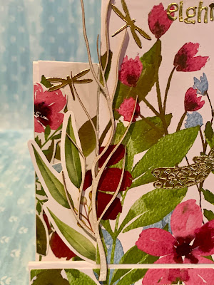
And then to contribute to the overall 'messy garden' feel I added in this twig I had left over from this lovely branch and birds set.
The other embellishments were pretty much just added to give it that 'I just wandered into this field of wild flowers' look. I struggled with how busy this ended up - even the number 'eighteen' at the top I woud have prefered to have mounted nicely on a backing strip and displayed prominitely somewhere, but once again, in an effort to make it less about me and more about the person recieving it, I atempted to relax a bit into a more casual style 💚
And thats it from me today folks... thanks for bearing with me to the end of my creative ramblings.
I hope you enjoy your own creative adventures until next time.


